Put the S&P 500 and Nasdaq 100 side by side and their charts often rise and fall at almost the same times. Yet the closing percentage changes can be very different. That combination—similar shapes, different strength—is what makes the pair useful to watch.
The key is not simply the number of companies, but which businesses carry the most weight. The S&P 500 offers a broad view of large U.S. companies. The Nasdaq 100 focuses on large non-financial companies listed on Nasdaq. Use the first for the wider large-cap picture and the second to read the strength of large growth companies.
Start with the constituents
S&P Dow Jones Indices describes the S&P 500 as a cross-section of major U.S. industries, weighted by float-adjusted market capitalization. Larger companies therefore have more influence. Nasdaq’s official overview defines the Nasdaq 100 as 100 of the largest domestic and international non-financial companies listed on Nasdaq. Financial companies and businesses listed only on other exchanges are outside its universe.
| Feature | S&P 500 | NASDAQ 100 |
|---|---|---|
| Companies | 500 leading U.S. companies | 100 large non-financial Nasdaq-listed companies |
| Exchange | Eligible U.S. exchanges | Nasdaq |
| Financial companies | Included | Excluded |
| Weighting | Float-adjusted market capitalization | Modified market capitalization |
| What to watch | Breadth across large-cap sectors | Leadership in large growth companies |
The S&P 500 is not simply the 500 largest companies ranked mechanically: eligibility criteria and an index committee shape its membership. Nor is the Nasdaq 100 exclusively technology. It includes retailers and healthcare businesses, among others. Its growth-oriented profile comes from the resulting mix and weights of its constituents.
Why the charts look so similar
Both indexes trade through the same U.S. session and respond to the same economic releases, interest rates and earnings news. They also share major companies such as Apple and Microsoft. Buying or selling in those businesses moves both indexes at once. Their common emphasis on large companies adds to the resemblance.
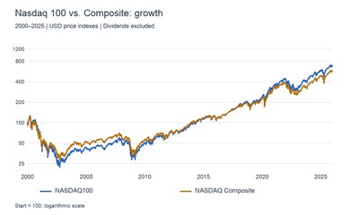
That similarity is a reason to compare them, rather than dismiss one as redundant. Look at which index advances further during the same interval. The gap helps distinguish a rally led by growth companies from one spreading across other large-cap sectors.
Similar shapes, different-sized moves
The Nasdaq 100 concentrates exposure in fewer companies and growth-oriented industries. Buying in those areas can produce a larger advance; profit-taking or disappointing earnings can also produce a deeper fall. The difference is a useful clue to where investors are directing their money.
Suppose the S&P 500 rises 1% while the Nasdaq 100 gains 2%. That points toward large growth companies leading the advance. It does not establish strength across the entire market. Look at other S&P 500 sectors, banks and smaller companies to assess how widely the buying has spread.
Use yields and earnings to explain relative strength
Growth-company valuations place substantial weight on profits expected years ahead. Higher interest rates reduce the present value of those future profits, putting pressure on valuations; lower rates can support them. Comparing the Nasdaq 100 with the U.S. 10-year Treasury yield makes this tension easier to follow.
If yields rise and the Nasdaq 100 trails the S&P 500, rate pressure on growth companies is a natural starting point for analysis. If the Nasdaq 100 stays strong despite rising yields, examine whether earnings or new demand expectations are outweighing that pressure. Reading which force is winning is more useful than treating every rate increase as an automatic stock-market decline.
Compare percentage changes at matching times
On Jibun Stocks, place the S&P 500 and Nasdaq 100 next to each other. Add the U.S. 10-year yield and a semiconductor index when useful. Start with the signs and percentage changes, then follow the opening stretch, sudden moves and the period approaching the close.
When both rise but the Nasdaq 100 breaks its earlier high first, growth companies are leading. If the S&P 500 recovers while the Nasdaq 100 lags, look for support from other sectors. A gap that opens briefly in the morning tells a different story from one that widens into the close: the comparison separates a short-lived reaction from persistent leadership.
Each chart’s vertical axis adjusts to its own displayed data. Compare the printed percentage changes and percentage reference lines, rather than pixel height or slope alone. Index point levels also use different scales. A larger index number does not mean a stronger market. Match regular-session indexes with each other rather than mixing them with after-hours CFDs.
Two index holdings do not necessarily mean more diversification
The indexes share many major companies. Holding products linked to both increases overlapping exposure to those businesses. Adding the Nasdaq 100 to the S&P 500 tilts the mix toward large growth companies; it does not introduce a completely separate market.
An index chart is also different from a yen-denominated ETF tracking it. Currency movements and trading hours affect the ETF, while a price index and a dividend-inclusive total return measure answer different questions. Compare regular indexes to follow the market, then check the currency and product specifications when assessing your holdings.
Use the S&P 500 for the market’s foundation and the Nasdaq 100 for growth-company momentum. Start with their similar shapes, then study the differences in percentage change, recovery speed and the timing of new highs. Those differences reveal which part of the market is setting the pace.